
The end point assessment (EPA) for my Creative Digital Design integrated degree apprenticeship required me to work with a real-life client to produce a digital design project that met the required knowledge, skills and behaviours to complete the apprenticeship. The EPA period lasts for 6 weeks, in which the project must be completed within.
For my EPA, I worked with Red Kite Interactive, a new start up studio in Newcastle for digital art and tech students to have a space to develop, create and output either a game or interactive project to gain experience and insight into an ever-changing digital landscape.
I was asked to design:
Logo development in various formats including ident.
Brand guidelines.
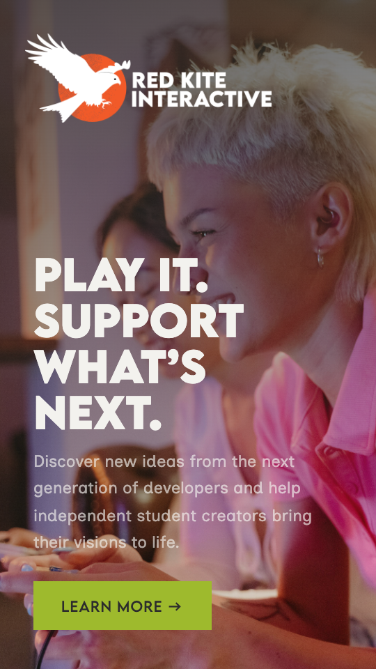
Website - Mobile first.
Social Media Campaigns.
I started work on this project by plotting out each week of work:
Research and analysis.
Logo development.
Brand development.
UX UI design.
Social media marketing campaign.
Review work and prepare project for submission.
Week 1: Research and analysis
Before starting on any design or campaign development, I needed to understand who I would be communicating to. This information would help to inform the design decisions I make in my project, understanding what visual cues I’d need to resonate with the audience, and the overall direction to take the brand storytelling. I carried out surveys with Newcastle College students to understand the following areas:
Audience and positioning: defining who our audience is, and where our brand could fill a gap in their market
Audience behaviours: understanding the digital habits and gaming interests of the students, and what would resonate with them
After analysing the results from the students, I came to the conclusion that the brand should be:
Creative. Futuristic. Colourful. Playful. Experimental. Tech-led.
Sociable. Collaborative. Foster community. Connect creatives. Peer community.
Career-focused. Mentorship. Game showcases. Student success stories. Behind-the-scenes content.
Accessible. Beginner friendly. Approachable. Inclusive. Affordable.
From this information, I set up two personas for Red Kite.
-
Age: 19
Occupation: Digital Arts Student
Personality: Creative, playful and a home-bodyBackground:
Chloe wants to transition her illustration skills into 3D game design to replicate the cosy, stylised games she plays. Her assumption that most opportunities are restricted to London makes her feel like an outsider to the UK games industry, especially as she plans to stay in the North.Goals and motivations:
Learn from clear, beginner-friendly tutorials to start 3D modelling and illustrating for games.
Connect with local, like-minded creatives to build confidence and find community.
Discover local studios or remote opportunities that can make a career in the North possible.
Pain points:
Analysis paralysis: She is overwhelmed by the tons of online learning materials and doesn’t know where to start her journey into 3D and game design.
FOMO: Feels geographically disadvantaged by not living in London.
-
Age: 20
Occupation: Digital Tech Student
Personality: Creative, playful and a home-bodyBackground:
Tom is a dedicated gamer who has already built and released a few custom game mods. His dream is to build original games, but while his technical ability is great, his artistic and creative side is lacking. Networking isn’t his strong suit and he struggles to make connections IRL.Goals and motivations:
Learn how to turn modding from a hobby into a professional practice.
Launch an indie project as part of a multidisciplinary team.
Get a foot in the door with established studios.
Pain points:
Skill gaps: Needs artists and writers to bring his technical skills to life.
Lack of direction: Understands coding, but doesn’t understand how the industry works.
Week 2: Logo development
I had already been provided with a logo for Red Kite Interactive. I expanded upon the logo with different variations for various use purposes, including light mode and dark mode versions.
I was also asked to create an animated ident to bring the logo to life. My main sources of inspiration came from:
The image of the bird. This brought to mind thoughts such as “fledgling” and “ideas taking flight”, which tied in perfectly with the narrative of the brand. I sourced various videos of birds taking flight as references.
Pixel art, an art style that is popular within indie games for its ease of replication (compared to hyper-realistic art styles) and associations with nostalgia.
I created the ident using After Effects and used stems from A. G. Cook’s 7G Files and recordings of birds taking flight from BBC sounds for the audio.
Week 3: Brand development
Off the back of the logo, I worked on the branding. This included deciding the tone of voice, typography and colour palette.
-
I firstly wanted to establish the tone of voice in order to inform other design decisions. I referred to the survey results to ultimately decide these approaches.
Fresh, fun, friendly.
Red Kite Interactive is enthusiastic about platforming new talent full of ideas. We know how to talk to young people without giving them the “ick.” The way we speak is clear, direct and sincere. We champion the work of our students while ensuring the focus stays on them rather than us.Accessible and inclusive.
We believe game development is for everyone, and we want to advocate for diverse stories and perspectives. We also know that entering the games industry can be daunting, and we don’t want to overwhelm anyone with tech jargon or business buzzwords.Nurturing community.
For many students, Red Kite Interactive will be their foot in the door to real job opportunities after university. By providing career opportunities, creator showcases and community, we ensure our team feel supported, encouraged and ready for the next steps in their career.
-
Headings: Lemon Milk
This is the typeface that appears in the finalised logo, so it made sense to make it a part of the brand typography.Paragraphs: Inclusive Sans
As part of Red Kite Interactive’s mission includes accessibility and inclusivity, I selected this typeface as it felt contemporary, modern and clean while also being designed for readability.
-
The core brand colours were taken from the logo I was sent from the client, which I then named to be in theme with the brand’s mission.
Lava Zone Orange #F15A29
The brand’s core colour. Abiding by WCAG’s colour contrast guidelines, this colour can only be used on the other core colours when it is in large bold text.Tech Noir #2C2C2C
The palette’s dark colour. This can be used with the off-white whenever, but sparingly with the core orange.Mana Glow White #F3F2EE
The palette’s white colour. This can be used with the dark colour whenever, but sparingly with the core orange.
As the core palette could be quite restrictive, I expanded the colour palette for when an accent colour is needed. I aimed to keep all the colours within a slightly autumnal palette to complement the three core colours.
XP Green #9EBA2D
Green is good to have in a palette as the “go” effect is believed to increase click rate.Boss Battle Red #D60105
A high urgency colour that could be used for sales or to indicate an error / urgent alert.Water Level Teal #0F4C5C
A darker colour to act as an alternative to the black, and to contrast with the orange as a complementary colour.Legendary Amber #F1A512
Another lighter brighter alternative, this colour indicates excitement.
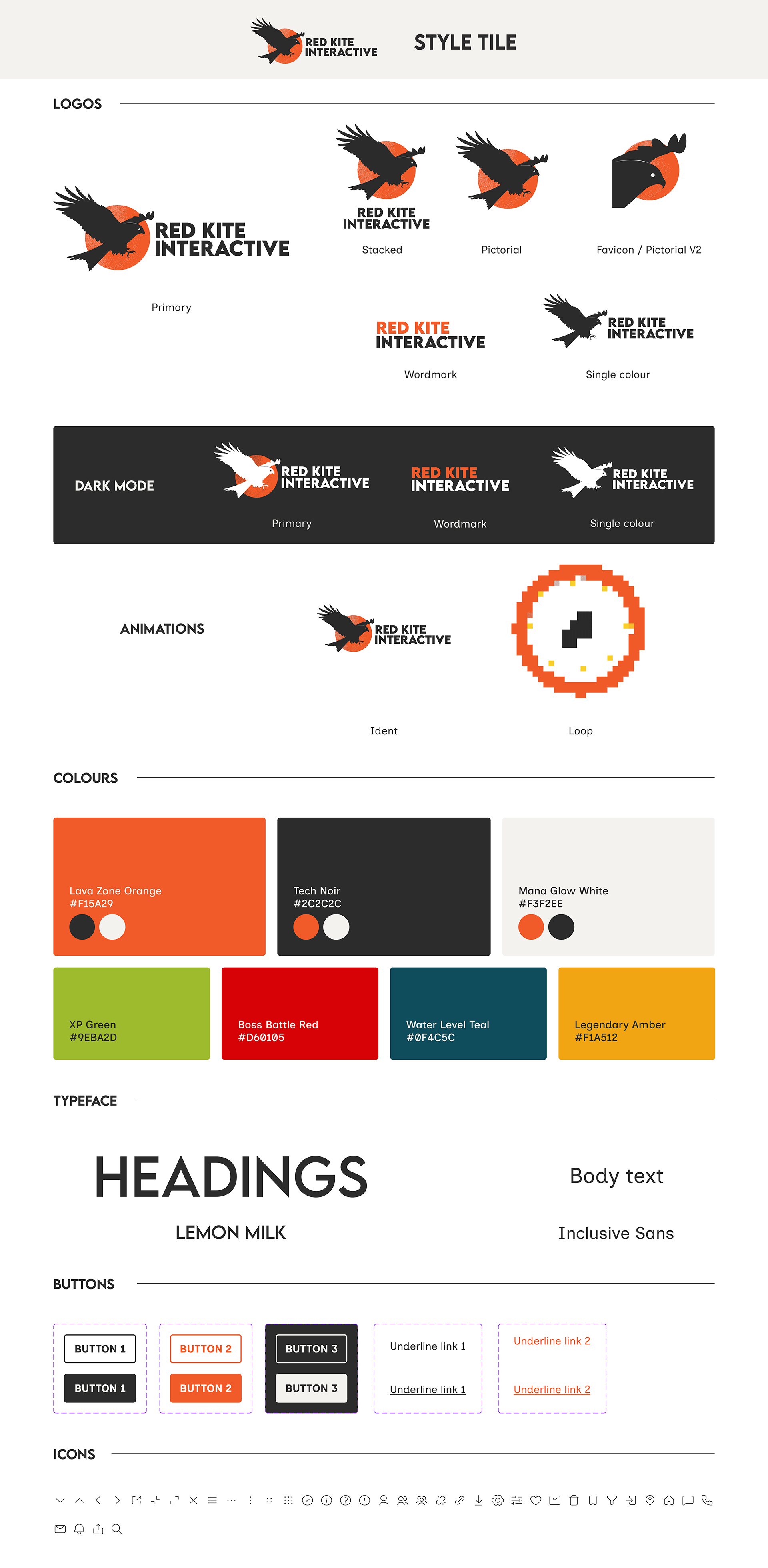
“Style tile” created for client. View the prototype.
Week 4: UX UI design
I started by reviewing various competitors, including Facepunch, Wildboy Studios, Ramen VR, High Tea Frog, Dink, Kiln, Nosebleed Interactive, Cake Bash, Team Cherry, Super Giant Games, Sunscorched Studios, Silent Games Studio. My personal favourites for their interactivity and modern, clean and bright layouts were Facepunch, Wildboy, Ramen and High Tea Frog. These would lay the foundations for the UX and UI for Red Kite Interactive.
I knew from the survey I had initially carried out at the start of this project, it was important for the website to feel creative, experimental, fun, colourful, playful, futuristic and tech-led. I also wanted to include things people had highlighted as being important, such as the sense of community and behind-the-scenes updates.
I planned to include:
Homepage
List of games
About / services
Meet the team
Community / news
Career opportunities
Contact us
In the same vain as other sites I had researched, the aim was to get the majority of these sections on one page as opposed to various pages, reducing the sitemap and making everything easy to find.

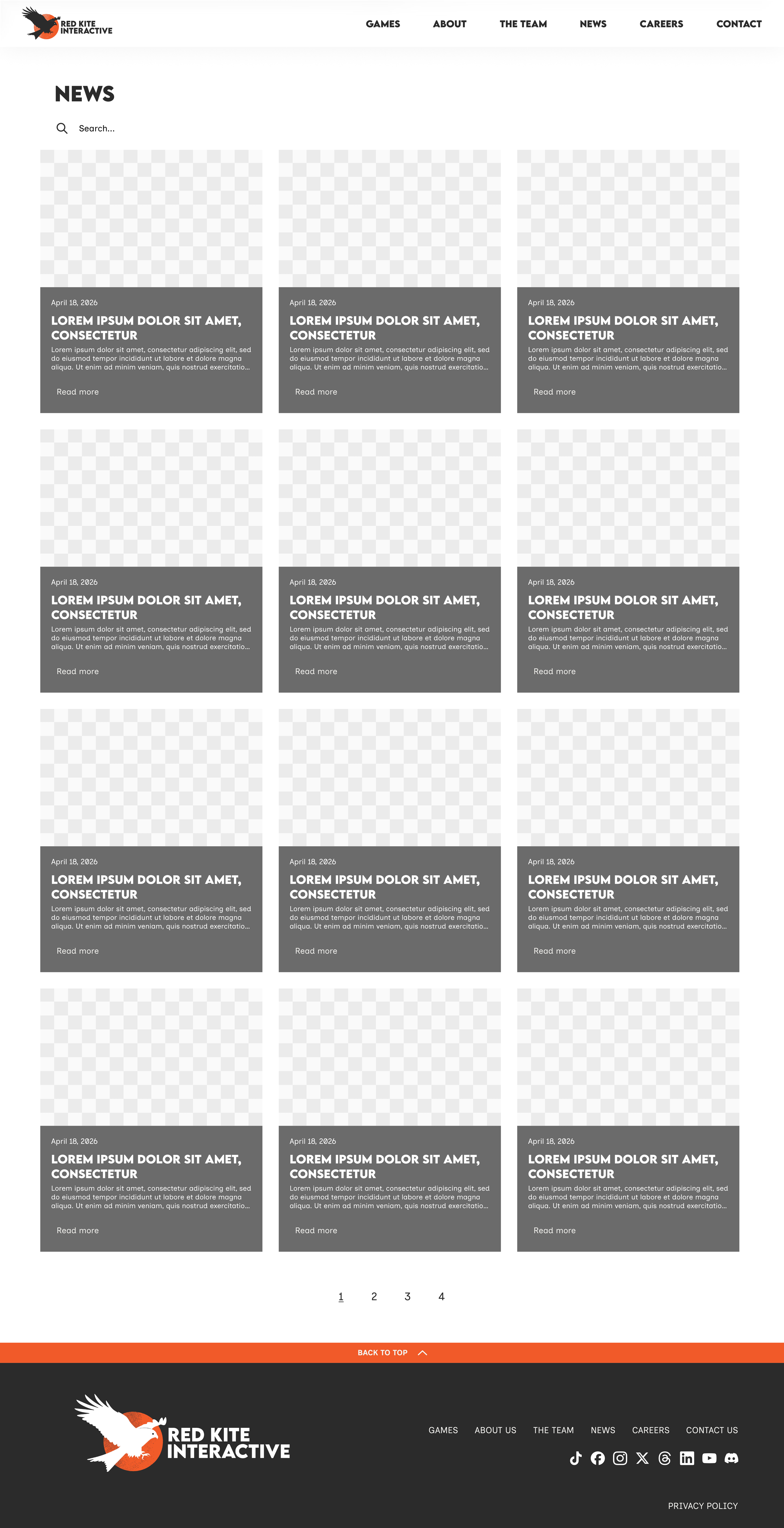
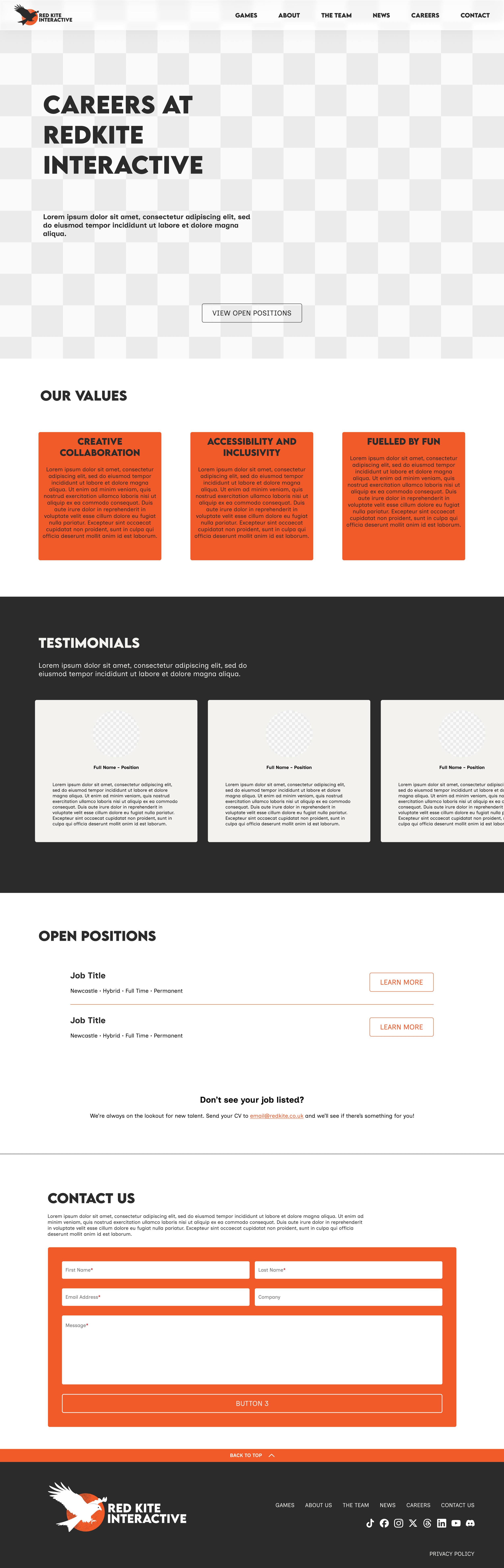

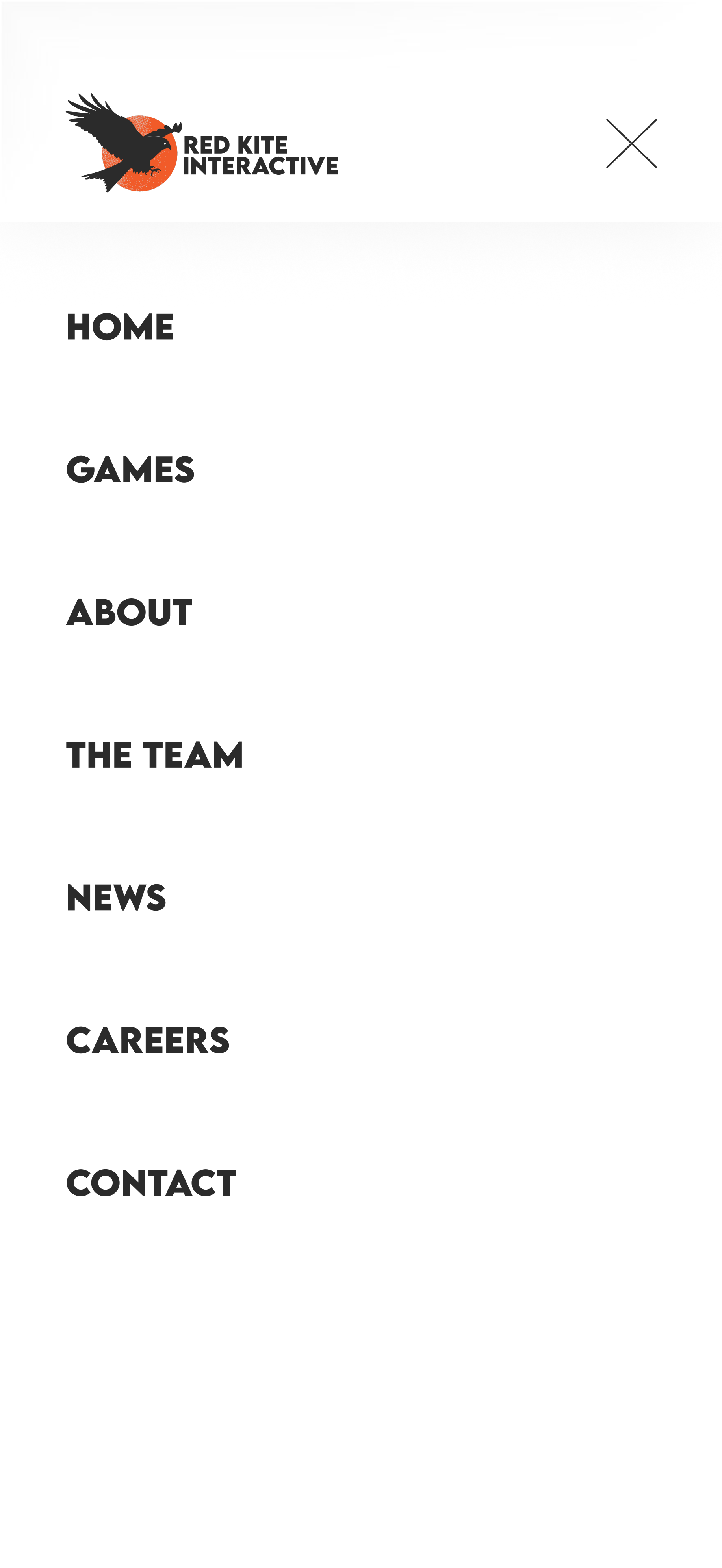


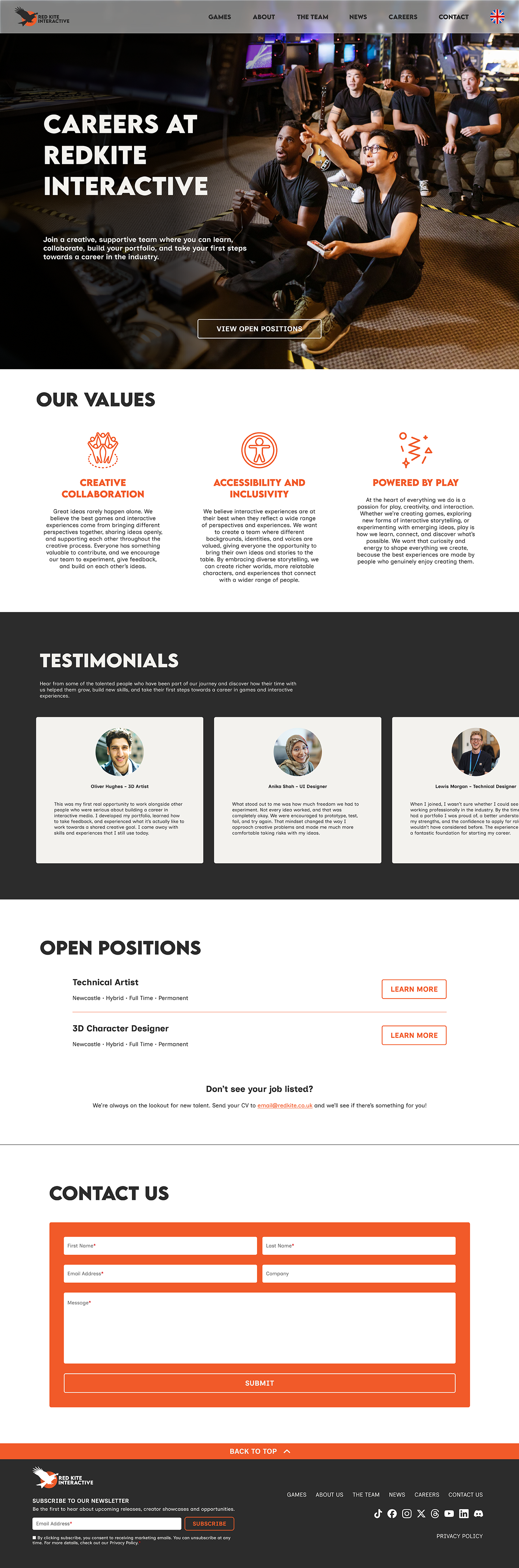
Now that I would be preparing to move onto the UI part of the project, it was time to work on the interactive element of the header, as inspired by Wildboy Studios and Facepunch. I used Adobe Illustrator to export the separate graphics and imported them into Spline, where I would create the interactive scene. This effect is subtle so wouldn’t distract too much from the website, but would still signify to the user that this brand is fun, interactive and embraces tech.
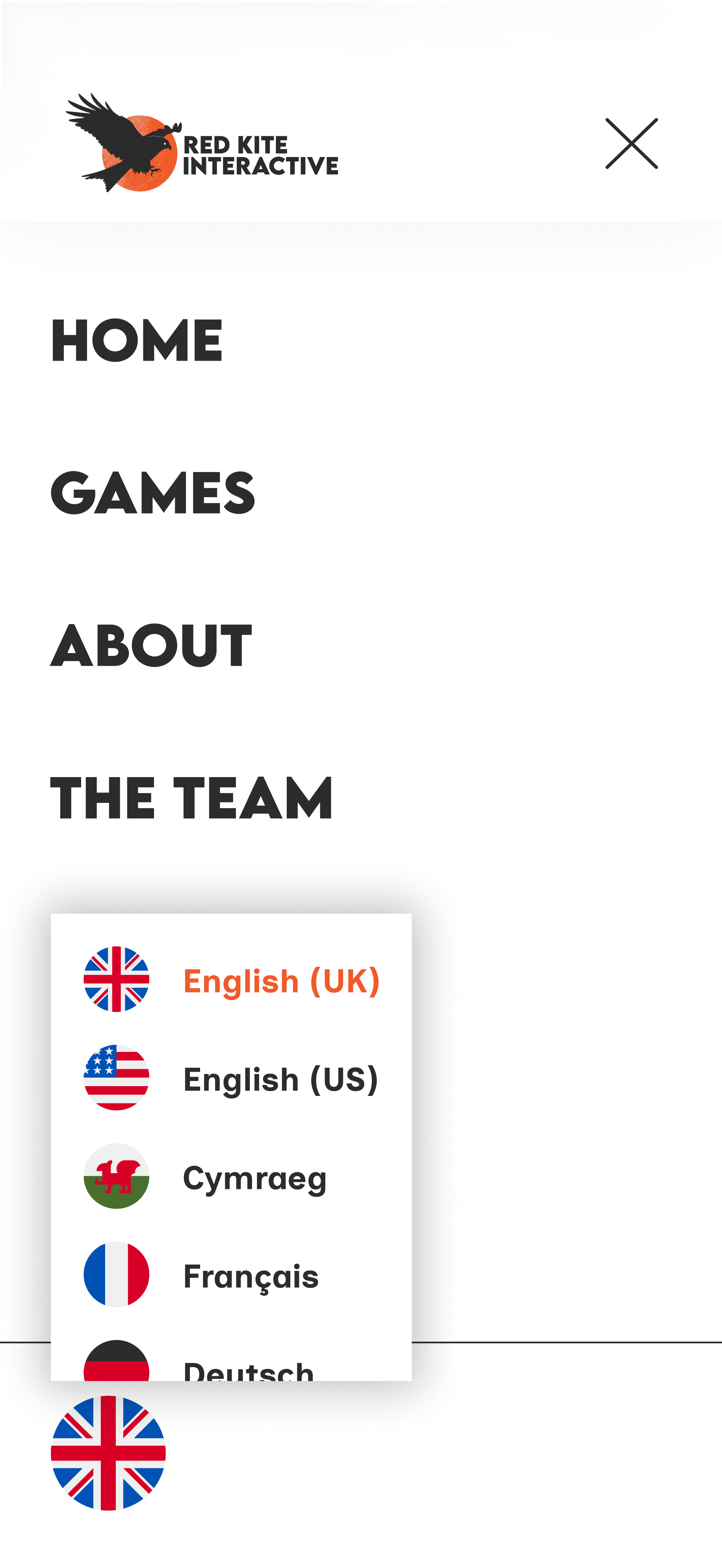
To create interactive assets for the UI, I created various components for both mobile and desktop, using the variant property. These would include hover states for buttons and links, as well as expanded versions of assets that are clicked on. For mobile, I ensured all hover states were set as the base state.
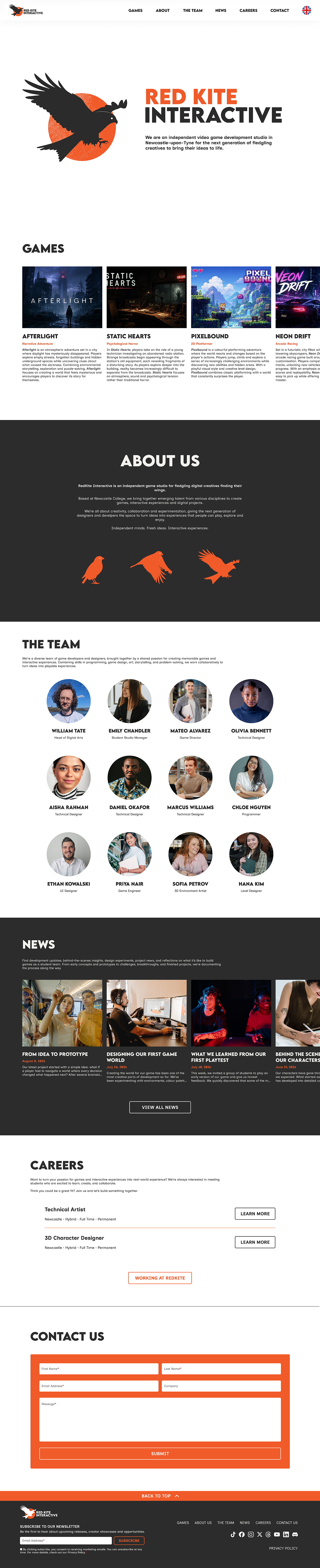
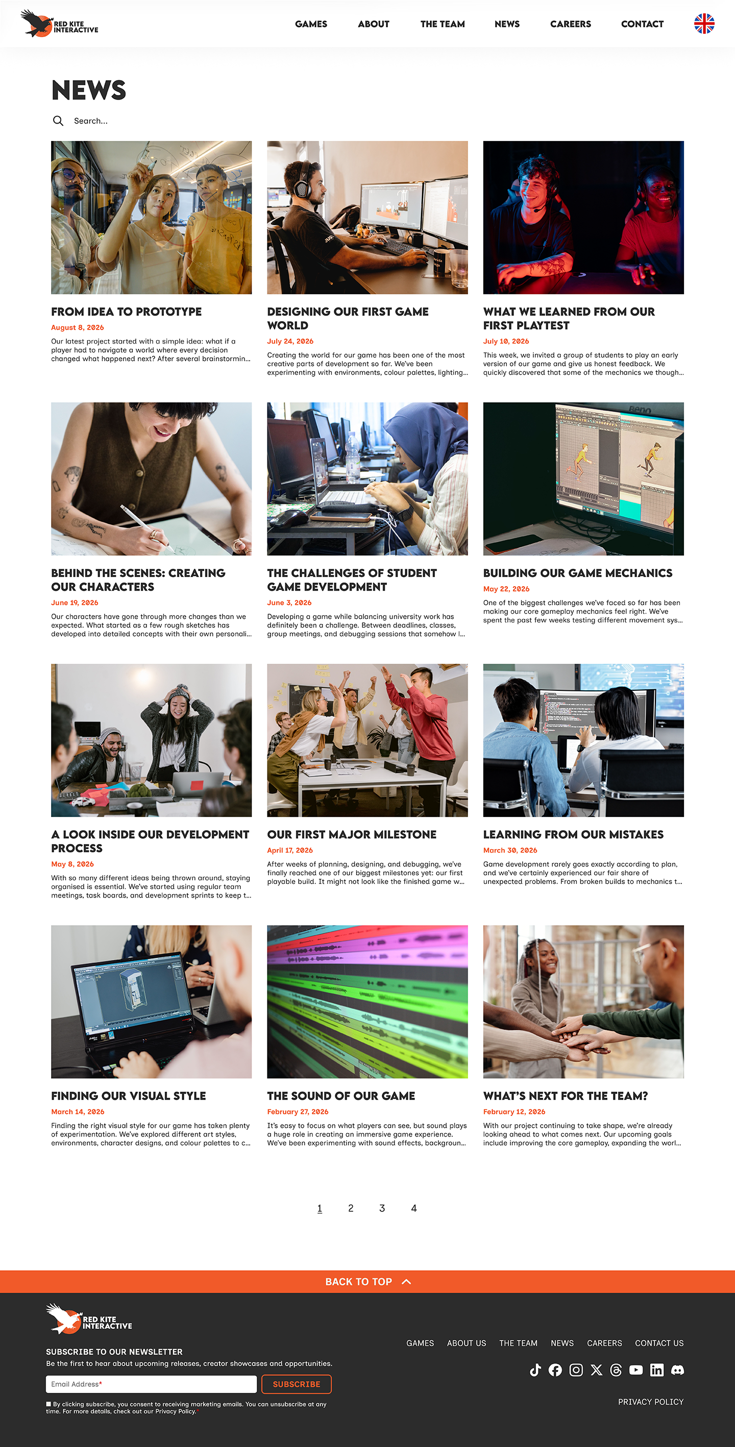
The UI part of this project includes tidying and refining the UX, adding images and colours, replacing Lorem Ipsum with copy, and ensuring interactive elements were behaving correctly.
The copy was generated by ChatGPT, as were the images for the games in the Games section. Other images were stock images from Pexels, except for William Tate’s photo, which I was able to source from LinkedIn. All of this is intended to be placeholder.
Some UX changes include a translate option being added to the main navigation, to ensure inclusivity and accessibility. I added a “Back To Top” strip to the footer, making navigation on-site easier. Another addition to the footer is the email newsletter subscription form, complete with a checkbox for GDPR purposes. The navigation menu bar was given a liquid glass appearance, signalling how the brand is up-to-date on digital trends.



Week 5: Social Media Campaign
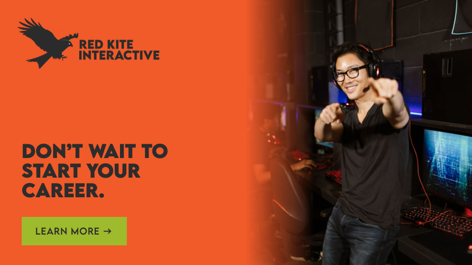
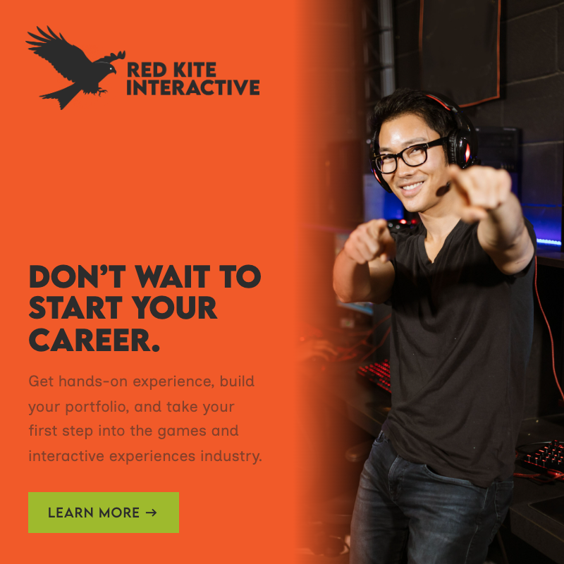
I looked at the competitors I’d reviewed for website inspiration and checked out their social media pages to begin planning my social media campaign, but was underwhelmed with a lot of their social media offering. Many of them didn’t seem to post consistently or much at all, leaving me to come up with a campaign with no basis for comparison and completely from scratch.
Earlier this year, I watched some of Figma’s Config recorded talks, and this included a talk from the co-founder of travel planner app Let’s Jetty, Nicole Martinez.
In her talk about branding, she discussed creating archetypes of a brand’s demographic and adapting the brand to speak to each archetype individually. In the case of Let’s Jetty, the core archetypes included:
The Organiser: The person leading the charge on planning trips
The Contributor: The person who wants to have a say in what gets organised, but doesn’t want to be in charge
The Venmo Friend: The person who just wants to be told what the plan is and who to send money to
Each person is an important part of Let’s Jetty’s audience, so they need to make different campaigns to reach each of them.
Referring back to the survey results and my own feelings as a Digital Arts student coming to the end of my qualification, I reflected on the main archetypes I wanted to target in my social media campaign.
-
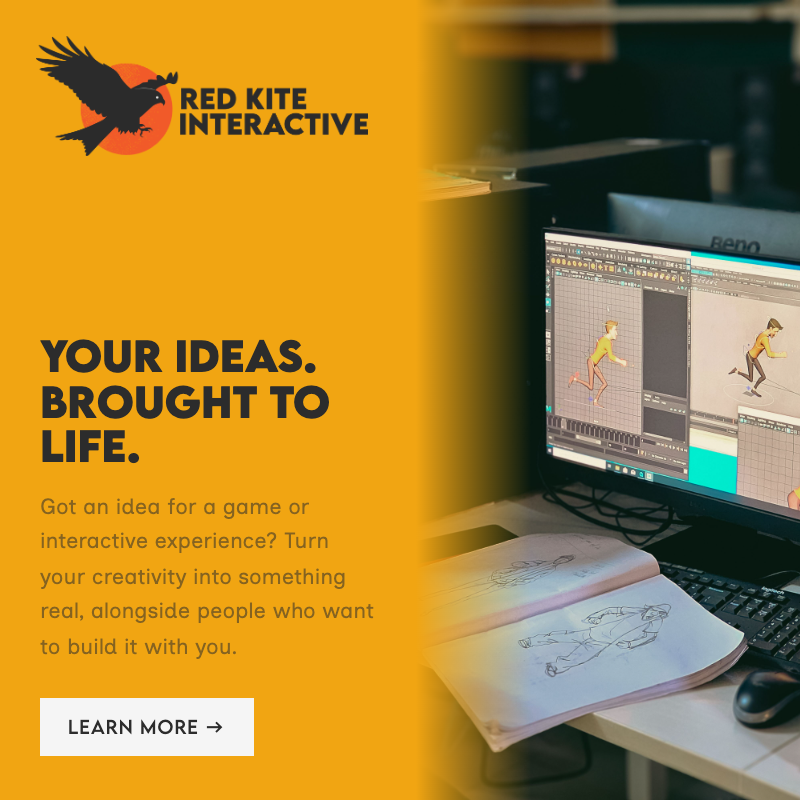
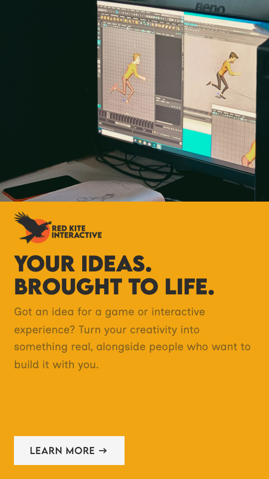
The student who’s full of ideas and dreams of making their own games or interactive experiences. The only thing holding them back is the framework to actually get these ideas off the ground.
-
The student that doesn’t know what’s next after university. Without hands-on experience or friends/family in the industry to offer them an internship, they’re looking for the reassurance that there is something for them to bridge the gap between academia and employment.
-
The student that moved away from home to study and doesn’t have the community around them. They’re hoping to foster meaningful connection with others they have things in common with, especially after they graduate.
While those archetypes fulfilled the sort of students that would be working at Red Kite, I realised there is another market: students or young people who don’t want to become game developers, but do enjoy playing games. These people can support the student creators and be the players of the games Red Kite distribute.
-
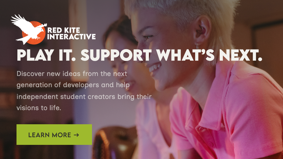
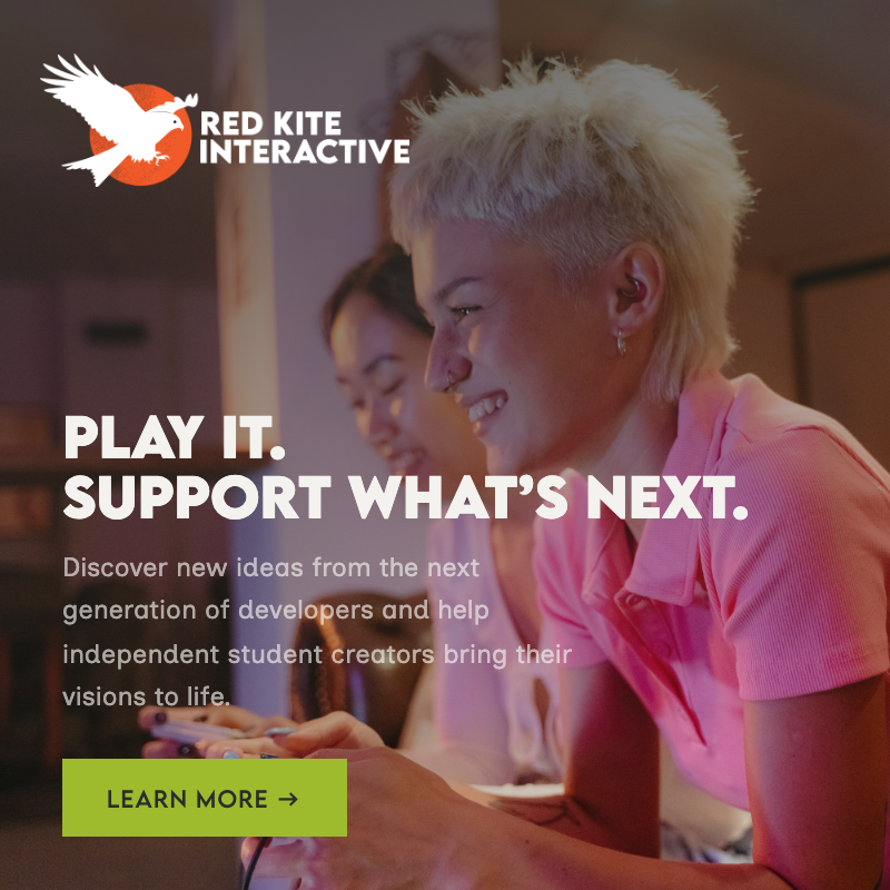
These gamers are involved in niche communities where they can discover small indie games that tell unique stories. Usually, these people are from underrepresented backgrounds and find joy in discovering stories from diverse backgrounds or seeing things from a new perspective.
-
These people avoid big releases and are more interested in supporting up-and-coming artists, especially those from their local community. They’re happy to fund kickstarters and love to see independent brands blossom.
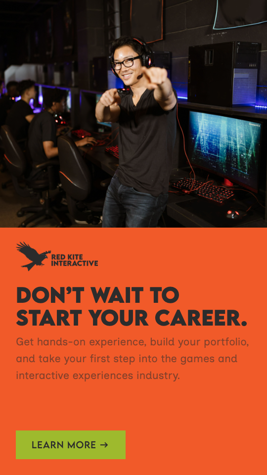
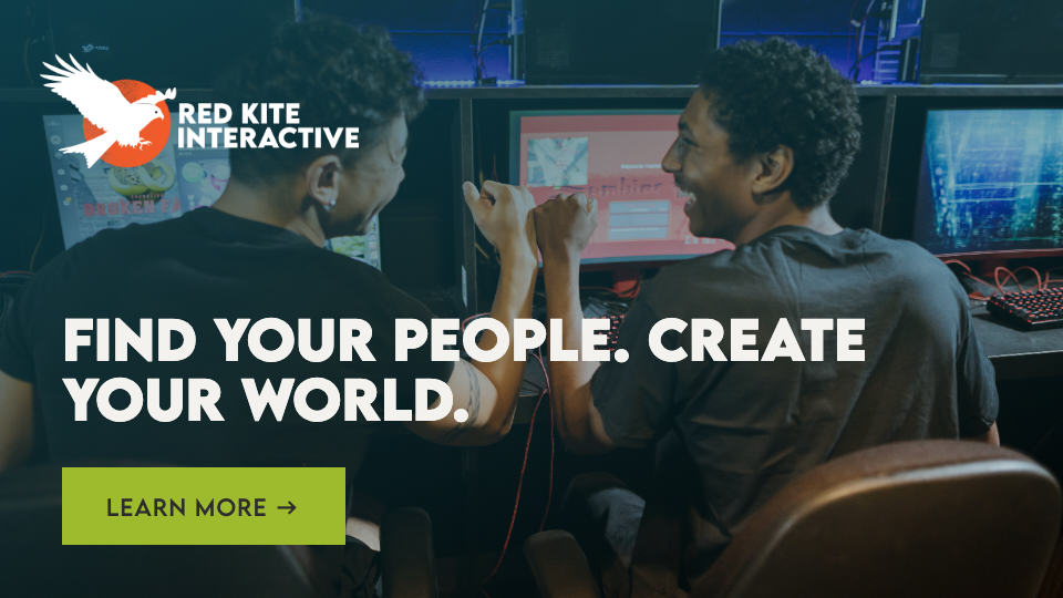
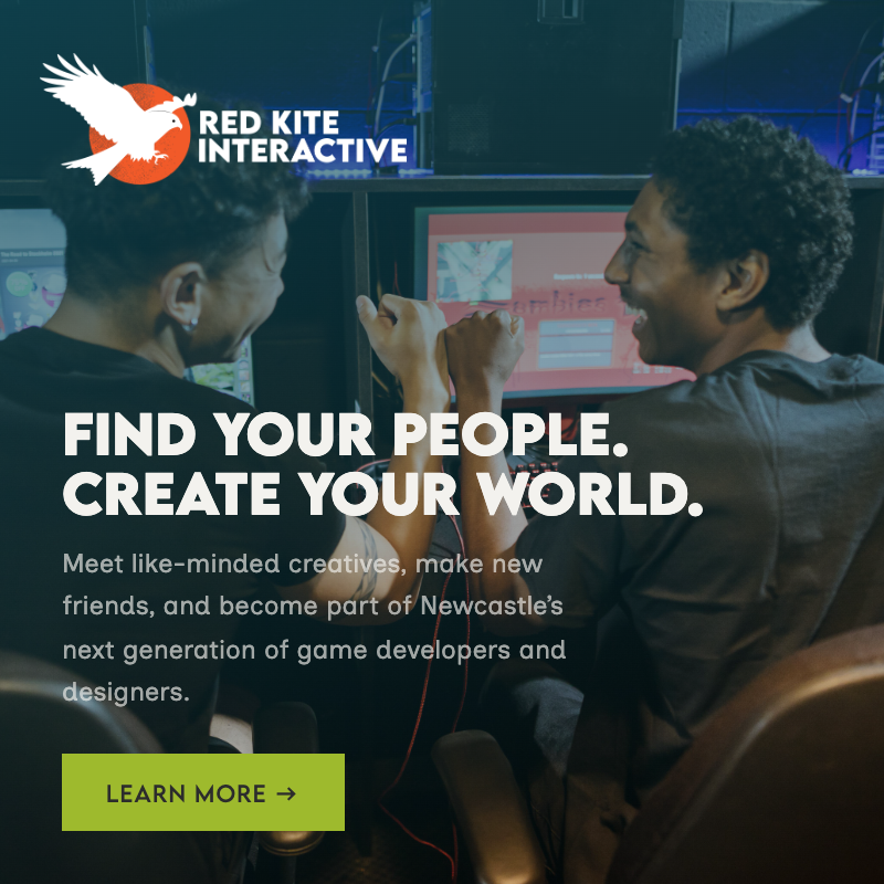
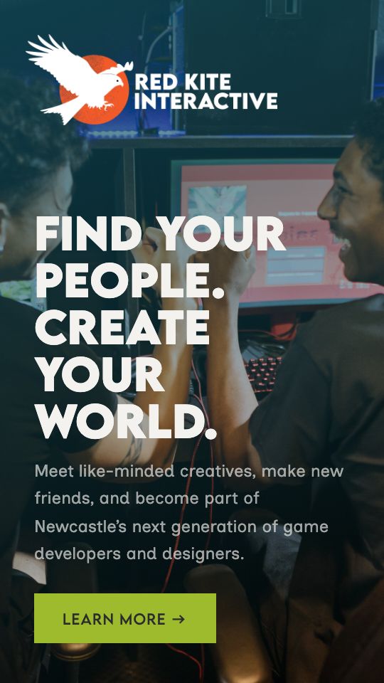
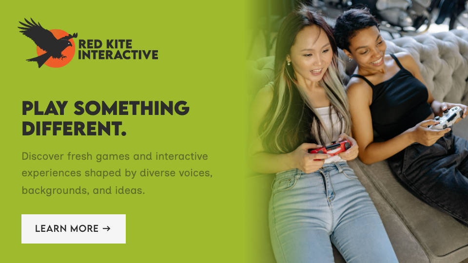
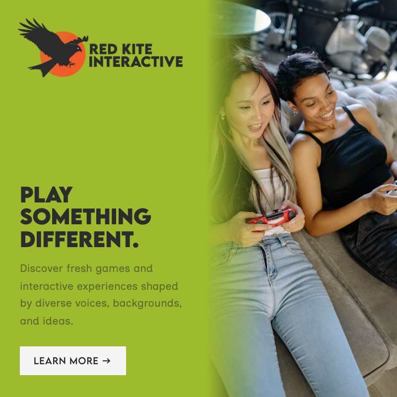
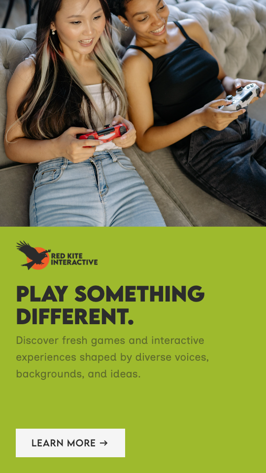
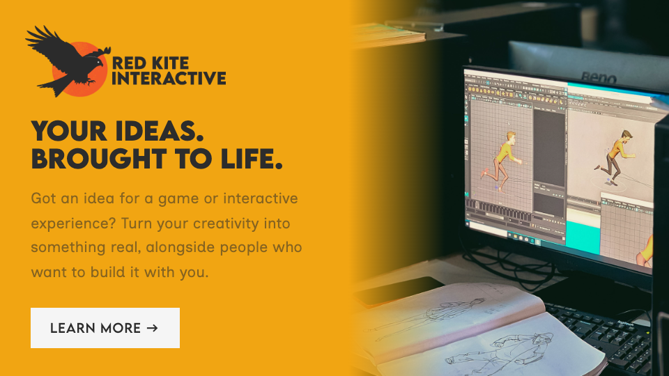
Feedback from the client and users was positive. I am pleased that I was able to complete everything in my original project scope, and that the client was pleased with the work I had produced. I believe that I have demonstrated my ability to manage and lead projects, including the initial planning of the project using agile methodologies. I have collaborated with my clients, created presentable deliverables to them and taken on their feedback. I completed user and market research to help guide my creative direction, and created user personas to understand the target demographic. I demonstrated my understanding of the power of branding throughout my work, especially at brand deck level. In my use of various programmes including Photoshop, Illustrator, After Effects, Figma and Spline, I have evidenced my understanding of the purposes of each tool and the workflows when working cross-platform. I have demonstrated my knowledge of UX and UI principles, including the importance of mobile-first design, accessibility and GDPR compliance. I have explored new technologies, such as interactive 3D experiences as seen in the Spline integration for the website. I believe the deliverables presented in this presentation are professional and commercial, ready to be used by the client.